JEANNE INDRIANI

REIMAGINING FASHION
NEURODESIGN FOR FASHION & SUSTAINABILITY
This page shows the research and rationalization behind the project.
Introduction to NeuroDesign
NeuroDesign lies at the intersection of neuroscience research and design thinking practice. Hence the challenge lies in applying the information gained through studying brain functioning to design thinking practice efficiently and effectively. The exploration of conscious, subconscious and unconscious can now answer our questions regarding emotional and corporeal responses to design. The field suggests various design guidelines and propositions that attract the most attention and factors that influence whether our brains respond positively to images. Although, most research on the psychology and neuroscience of how we respond to visuals shows tendencies rather than absolute. Therefore, these principles should be used as guidelines, combined with the designer’s intuition


At the beginning of the project, I tested several NeuroDesign principles within a more straightforward 2D presentation format with 10 participants. They were asked to vote between two similar pictures that look more appealing. After the decision is made, I then revealed a prediction of which one the majority will vote on (circled in red) on the next presentation slide. These predictions are made according to what generally captures our brain’s attention according to Neuroscience findings. In conclusion, the predictions were mostly correct with slide D receiving equal votes for both options.


NeuroDesign offers an explanation as to why both pictures have reasons to be chosen. People generally have an instinctive preference for curves over sharp or angular designs. Blue is also the most universally liked colour due to its common association with the sky and water. Sharp shapes signify objects that can inflict pain so it’s natural that our visual brain instinctively avoids them.
Red is regularly used as a warning colour because of evolutionary reasons. It is a sign of extreme heat and of bleeding. There is evidence that people act weaker when facing an opponent wearing the colour red. Research shows that competitors in combat sports are more likely to win if they’re wearing red than blue. Submission to red is potentially an evolutionary by-product of recognising when a person’s face is flushed red with anger, hence more likely to attack.
For example, Target's, a store chain based in the US, use of an excessive amount of red seems to make people susceptible to spending more (perhaps makes us more submissive to retailer’s claims.) or dampens our rational thinking and encourages a more emotional response. (Source: NeuroDesign, 2017, Darren Bridger)
Priming
The third neuro design guideline that is within the realm of speculative and controversial is subliminal messaging. Studies show that “images that we see immediately before or at the time of a decision can influence our behaviour without having to persuade us rationally.” (Bridger, 2017). Thus, what started as an urban myth opened up significant conversations and research about how our non-conscious minds work. The first week was spent on further research and learning the basics of Unity. The learning process started with watching Youtube videos learning to navigate the software, and grasping the overall functionality of the tools.
Within the presentation slides that I presented to the participants, shapes that resemble letters are embedded, which when combined altogether read as ‘Zebra’. The voting happened at the end of the presentation and majority of the class voted for the Zebra picture. There are two possible explanations for this; 1) personal preferences for Zebra or 2) the influence of subliminally priming the audience with a message, sliping through the cracks of the conscious mind

Designing an Experiment in VR


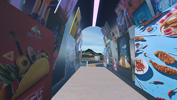
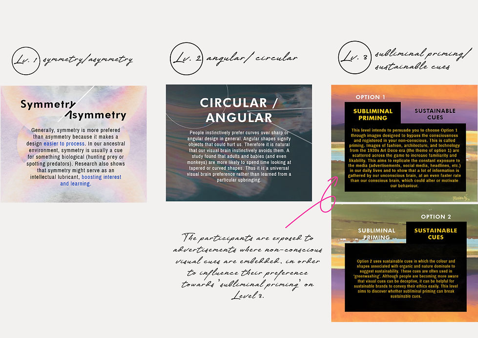
The survey participant starts by walking through the shopping center where they are exposed to shops and advertisements related to the neurodesign guideline tested on Level 3 (explained further below). Each levels are testing different design guidelines.

Retrofuturism serves as the primary inspiration for the structure’s overall shape and design, blending nostalgic (retro) elements with futuristic themes. This aesthetic reflects an optimistic view of technology, imagining a future where life is enhanced by rapid advancements—a way of looking forward through the lens of the past. This approach is fitting for the project, conveying that while the digital future is intriguing for its novelty and modernity, we experience it through the lens of our cognitive biases and natural instincts. The architecture reflects this duality, while the VR experiment explores how our past shapes our perception of the future.

Using Unity, my aim is to design an interactive and immersive survey where I will be able to test some of the Neuro design guidelines; symmetry, shape, and subliminal vs sustainable cues. As well as to explore pragmatically the theories that originated from the study of psychology and neuroscience for its application in design.
Message Shown After Completing Each Level


